Custom Typeface + Logotype for Speculative Branding of the SEGD (Society For Experiential Graphic Design) Conference in New York
Develop a custom typeface and logotype for the speculative branding of the SEGD (Society for Experiential Graphic Design) Conference in New York, capturing the city's dynamic energy. The design should seamlessly integrate with the event's visual identity, ensuring clarity, legibility, and visual appeal across various applications.
Duration: 2 weeks
Skills: Adobe Illustrator, Adobe Photoshop, Branding, Type & Logotype Design


Why Futura PT as the standard type?


Choosing Futura as the standard typeface complements the custom type in the logo lock-up, both sharing a geometric DNA that balances clarity, legibility, and a contemporary aesthetic, resulting in a cohesive and visually appealing design.
Pattern Development
Color Scheme

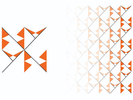
The pattern uses the initials 'N' and 'Y' in a geometric design with a gradient, symbolizing New York and adding dynamic visual appeal, perfect for an event representing the city's spirit and energy.
The color palette, combining dynamic orange, sleek black, and balanced white, embodies New York's vibrant energy and modern ethos, creating a striking and memorable visual identity for the event.

Process


Experimenting with font weight as it affects readability, visual impact, and the overall tone or mood conveyed by the text.
Exploring different arrangements and combinations of logo elements, such as the type and tagline, to optimize event recognition and impact.

Trying different color schemes to see how they affect the visual appeal of the type and space. Further conveying different emotions or messages.


Initial experimenation with different layoutings for front and back of Name Tags.
Iterating on different design features like readability, pattern while targeting simplicity.

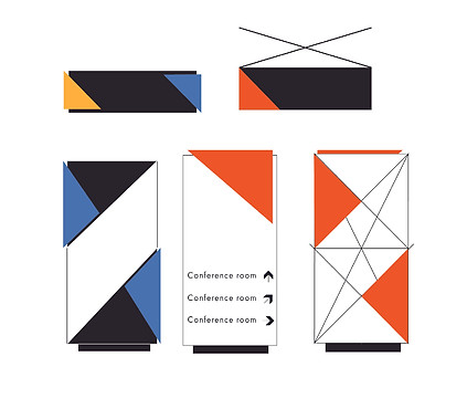
Exploring different possible interior wayfinding signages through size and layering.

Ideating how the custom type and pattern can vary in size and form while creating layouts for title slide.
Final Designs


Reflection
I've experienced significant growth in design, particularly through this project that taught me the importance of typeface selection, color palette development, and creating unique patterns. I've learned that typography goes beyond aesthetics, influencing communication and alignment with design messages. Developing color palettes has shown me how colors evoke emotions and shape perceptions, while creating patterns emphasized the impact of subtle symbolic elements. This project has honed my attention to detail, conceptual thinking, and creativity, which will be invaluable in my future design endeavors.